Modern Branding with a Creative Edge
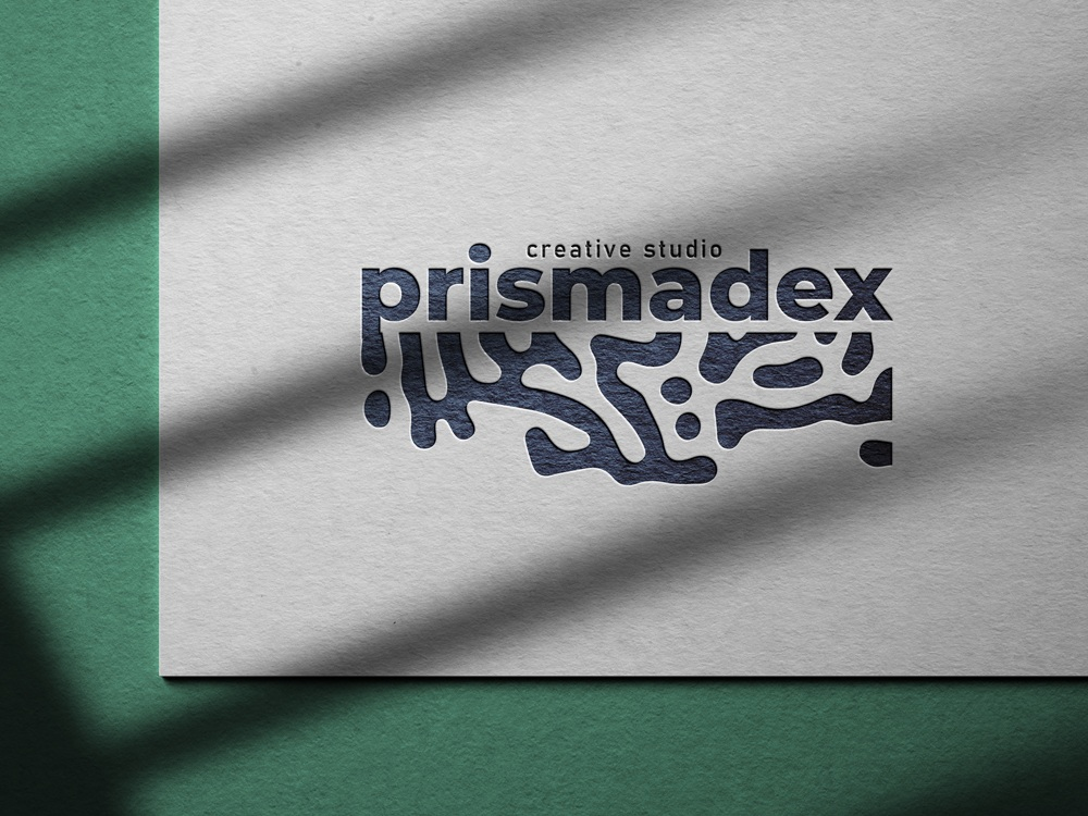
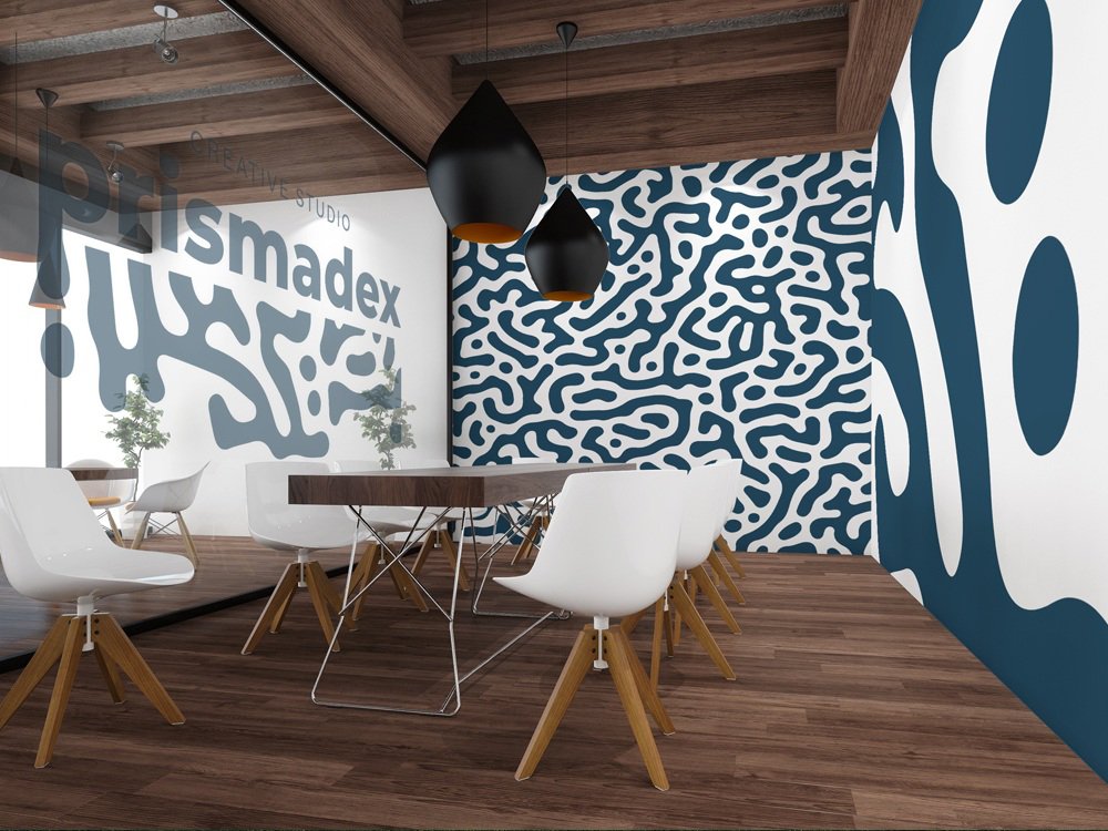
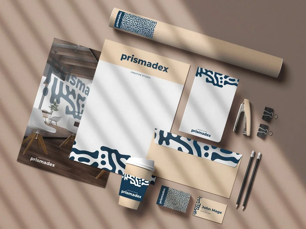
Prismadex Creative Studio received a brand identity reflecting its innovative and sophisticated style. Organic shapes represent creative flow, paired with a Swiss-inspired sans-serif font in deep navy to convey clarity and professionalism. The cohesive identity extends across signage and stationery, reinforcing a refined, forward-thinking presence.


